

Queue card
Lane psychology notes for gate stacks.
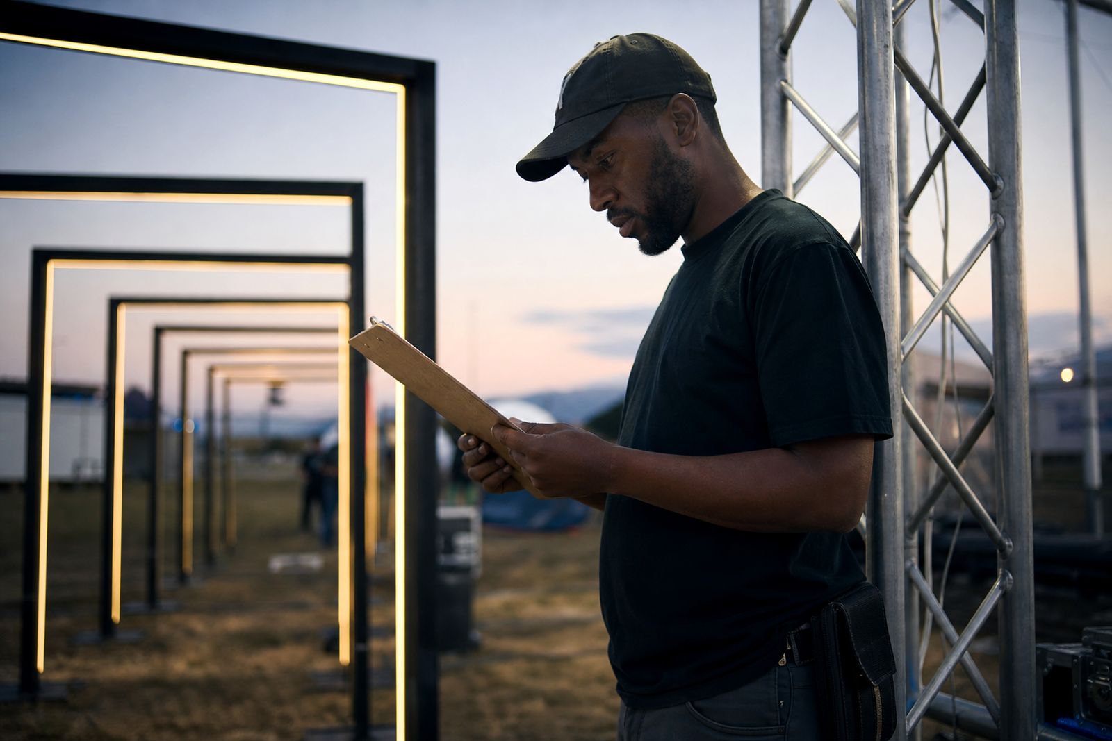
Queue card at the gate
Use the queue card where guests pause before scan, search, or sample handout. Print on stiff A5 or A6 stock so it survives wind at festival entries and retail forecourts. Keep a digital copy linked from our contact form for crews who need the current wording on phones.
Short fields work best when lane leads are calling counts over music and generator hum. On busy South African sites, note shade, barricade type, and merge points rather than writing long instructions. If load-shedding affects scanners or POS, add the manual fallback on the card itself.
What belongs on the card
A useful queue card covers lane name, expected peak period, guest trigger, and staff response in one glance. Add the exact entrance, wristband or ticket check, and the point where a queue must split for VIP, media, or families. Keep phone numbers off the public side if the card is visible to guests.
Cape Town pickup reference
For print specs, quantities, or card stock choices, use our contact form. We work from Woodstock, Cape Town, on queue cards used at festival gates, retail launches, and brand check-ins across South Africa.
What to capture before print
A queue card works best when it gives the lane lead a clean read at a glance. Keep the wording tight, because the crew may be managing scan points, sample handouts, wristband checks and guest questions while music, wind and generator noise compete in the background.
For South African activations, include the practical details that change how a lane behaves on site. That means the expected guest flow, where people merge, what happens when a scanner pauses, and how staff should respond if the queue starts to spill into a mall atrium, museum forecourt, hotel foyer or festival gate stack.
- Confirm the lane name and its exact position in the venue playbook.
- Note the trigger for a guest handoff, scan or search.
- Mark shade, barricade type and any merge point clearly.
- Add the manual fallback if power, scanners or POS need support.
Keep the card usable on site
Queue cards get handled, tucked into pockets and checked in changing weather, so the layout needs to stay legible under pressure. Stiff A5 or A6 stock helps the card survive wind, dust and repeated handling during load-in, overnight care and strike windows.
Use plain lane language and avoid long blocks of text. Short fields make it easier for teams working with truss, cable ramps, ballast and generators to find the right instruction fast. If the activation includes a walk-through light tunnel, mirror maze install, lantern field or ripple pavilion, add the control point that keeps guest movement steady and safe.
When the wording changes between sites, keep a digital copy ready through the contact form so crews can pull the current version on a phone before doors open.
Fit it to the activation flow
A strong queue card does more than label a line. It supports the rhythm of the whole activation, from the first guest pause to the last handover. That is useful at festival entries, retail launches, night markets and corporate courtyards where the lane must work with the venue, not against it.
Astonishing Studio designs, builds and runs experiential activations across South Africa, based in Woodstock, Cape Town, with showrooms at Tyger Valley, Clearwater, Cresta, Baywest, Pavilion and Riverside. If you need help shaping the wording for your site, send the venue details and crew notes through the contact form and ask for a quote. We can help turn the practical details into a clear card that suits the day.
What our Brand Activation customers say
Verified Google reviews
Tell us about your activation
Send a note through our contact form with the venue or event, the date, the crowd you expect and the feeling you want, and we will come back with a practical plan and a quote.
Open the contact form